Tasks handled by Opus 5.5 include:
- Writing a blog post detailing website changes since the last post (18 Jul 2026), reviewing the git history and comparing old/new designs using screenshots.
- Highlight the new faceplate themes, the progressive blur between pages, and the new cartography map.
- List the AI models used, from most to least used: DeepSeek Flash V4.1, DeepSeek Flash V4.0, Kimi K3, Gemini Flash 3.8, Opus 5.0, Opus 5.5 and Gemini Flash 3.7.
- Emphasize that the work was mostly orchestrated using oh-my-pi, with some design decisions made using Kimi K3.
- Update (25 Sep 2026): append a section covering the changes made between 23 and 25 Sep 2026, with screen recordings of the animations and the page transition. That work was done solely by Opus 5.5, with no other models involved.
In July I rebuilt this site as a piece of Teenage Engineering-style hardware: a chassis, a status bar, and a PO-100 portrait module in the hero. Since then the device has had two more months of work: 35 commits touching 80 files, with 4,287 lines added and 1,360 removed. The chassis now takes swappable faceplates, pages go out of focus instead of cutting, and the Cape Town sketch in the hero has become an actual survey.
Here is what changed, how it works, and the models that built it.
The Log
| Date | What landed |
|---|---|
| 18–19 Jul | A photo viewer for post images; typography, spacing and hover polish |
| 30 Jul | The AI disclaimer component; mobile fixes for the photo viewer and post lists; a fix for a server error in the posts API |
| 17 Sep | A palette experiment (tried and dropped); an accessibility, SEO and dead-weight pass; keyboard shortcuts |
| 20 Sep | The device rebuild: faceplate tokens, the motion system, the power-on sequence, the PS1 plate and a 3D PO-100 |
| 22 Sep | Back to a 2D PO-100, OS-driven plates, the PS2 plate, the real-coastline cartography and the focus pull |
Visual Comparison: July vs. September
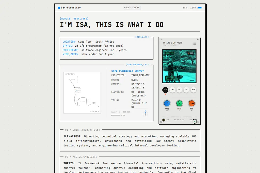
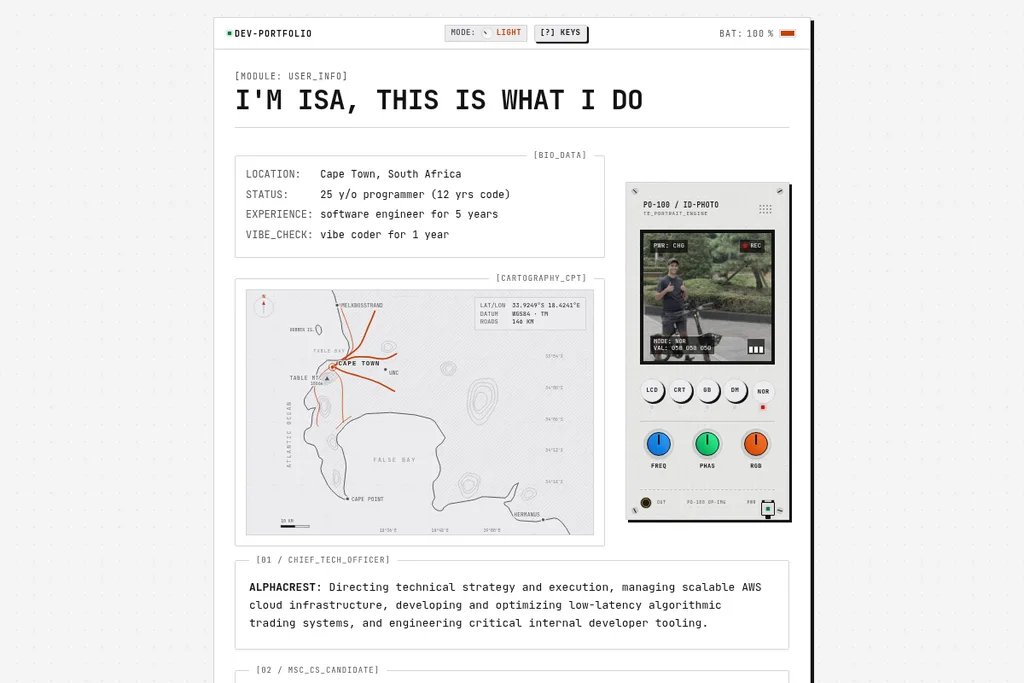
The July homepage had a single light/dark toggle, with colours written straight into the components. The September homepage keeps the chassis, but every colour now comes from the current faceplate, the cartography sketch and its spec table have become a full-width survey plate, and the status bar stays pinned to the top of the screen while you scroll.
| July | September |
|---|---|
 |  |
Deep Dive: Faceplates
In one week of September the theme system went through three rewrites: from July’s light/dark boolean to a palette id, then to faceplate tokens, and finally to faceplates that follow your operating system. The version that stuck treats a theme the way the hardware it imitates would, as a faceplate you swap onto the same device.
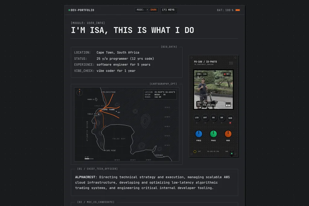
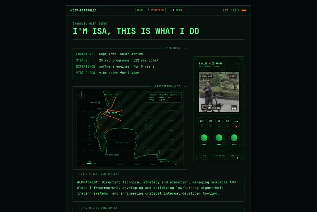
Six Plates
| LIGHT | DARK |
|---|---|
|  |
| PHOSPHOR | GAMEBOY |
|---|---|
 |  |
| PS1 | PS2 |
|---|---|
 |  |
- LIGHT: paper and ink.
- DARK: charcoal and off-white.
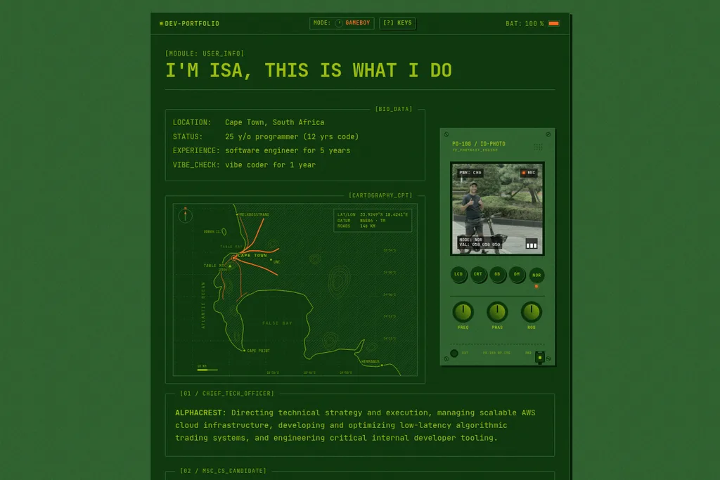
- PHOSPHOR: a green phosphor scope, with the heaviest scanlines of any plate.
- GAMEBOY: the four DMG greens, strictly enforced for every surface and all text. There is no fifth green, so even the row dividers are one of the four; only the orange accent and the warning amber come from outside the palette.
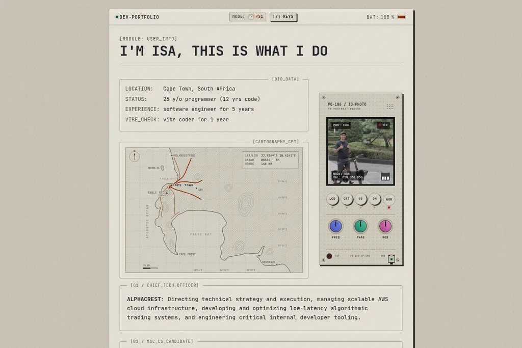
- PS1: warm console-grey plastic, with lighter modules laid on the deeper body.
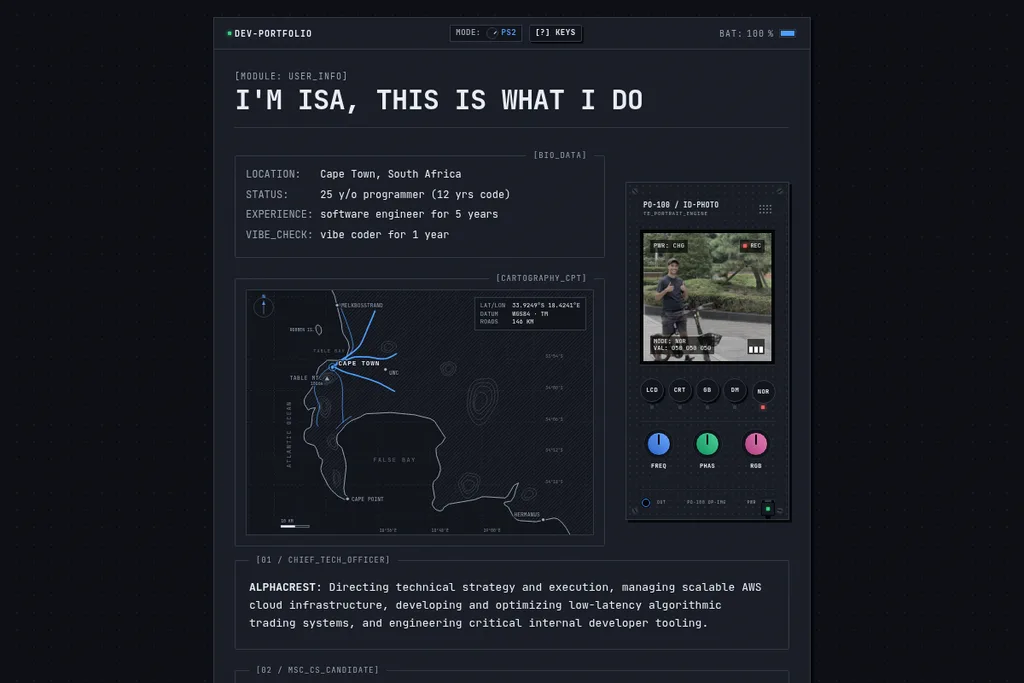
- PS2: Charcoal Black, after the SCPH-3000x moulding, with the PS2 wordmark blue on the interactive chrome.
Token-Pure by Rule
Every visual value on the site is a CSS custom property, defined once per plate in app.css. Nothing downstream may hard-code a colour, radius or stroke width: components use tokens (bg-panel, text-dim, border-line), so changing plates is a pure token swap. The stylesheet puts it bluntly:
If a component needs a per-theme override to look right, the component is wrong — fix the component, not the palette.
Adding a plate takes two edits: a token block in app.css, and a row in the registry in src/lib/stores/theme.js. This is the top of the PS2 block:
:root[data-theme='ps2'] {
	color-scheme: dark;

	--bg: #0d0f14;
	--panel: #1a1e27;
	--panel-sunk: #12151c;
	--hover: rgba(255, 255, 255, 0.055);

	--ink: #e9edf4;
	--ink-dim: #9aa5b5;
	--line: #333a47;

	--accent: #4d9fff;
	--accent-ink: #08111f;
	--ok: #35d07c;
	--rec: #ff5b5b;
	--warn: #ffb454;
	/* … code and hardware tokens … */
}
Contrast is measured per plate, and the numbers live in the stylesheet comments. On PS1, ink text reaches 11.5:1 on the panels and dim text 6.4:1; on PS2 the same pair is 14.2:1 and 6.7:1. The GAMEBOY plate’s text clears WCAG AA in DMG greens alone: 6.0:1 for ink and 5.0:1 for dim text.
Hardware May Be Coloured; Interface May Not
That line comes from the token definitions, and it’s what keeps the plates coherent. Interface chrome gets a single accent colour per plate, while physical parts (the PO-100’s case, knob caps and ports, and the TE-S10’s keys and display) have their own --hw-* tokens. The PlayStation plates spend the controller’s symbol colours on the PO-100’s three knob caps (cross blue, triangle green, square pink) and nowhere else. They also turn the TE-S10’s display into the console’s boot screen, black on PS1 and near-black with a blue crystal glow on PS2, and ring the PO-100’s output jack in the console’s LED colour: the PS1’s red lid LED and the PS2’s blue power light.
The one thing a plate never touches is the picture on the PO-100’s display. Its phosphor colours are “the tube, not the interface”: the case changes with the plate, the picture inside doesn’t, just like real hardware.
Following the OS, and the MODE Dial
Until you pick a plate, the site follows your system’s prefers-color-scheme, both at load and live: a light OS gets PS1, and a dark OS gets PS2. The plate is applied before first paint by a small inline script that hooks.server.js generates from the same registry, so a dark-mode visitor never sees a light frame while the JavaScript loads. The template placeholders are filled in on the server:
let stored = null;
try {
	stored = localStorage.getItem(${JSON.stringify(PLATE_KEY)});
} catch (e) {}
const os_dark = matchMedia('(prefers-color-scheme: dark)').matches;
const id = ids.includes(stored) ? stored : os_dark ? ${JSON.stringify(
	OS_PLATES.dark
)} : ${JSON.stringify(OS_PLATES.light)};

root.dataset.theme = id;
root.classList.add('js');
const meta = document.querySelector('meta[name="theme-color"]');
if (meta) meta.content = colors[id];
The MODE dial in the status bar is “a rotary switch, not a dropdown”: a listbox to assistive tech, and a knob to everyone else. Arrow keys walk the plates, Enter commits and Escape backs out. A pick is saved under a new plate key and ends the OS following. The old theme key is deleted on load, because the previous store wrote the auto-detected value there on every visit, and honouring it would have pinned returning visitors to a plate they never chose.
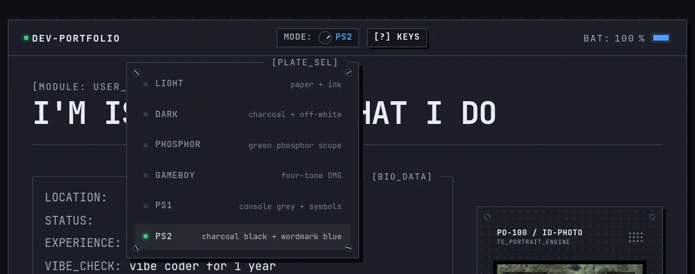
Changing plates doesn’t cross-fade. The chassis blinks instead, a 140ms stepped flicker, the way a device changes program, while the page behind it stays still.
What Didn’t Ship
On 17 September, three palettes called DAWN, DUNE and EMBER were added, reworked and removed again within fifteen minutes. Only the theme picker they arrived with survived. The plates that did ship came three days later with the token system (LIGHT, DARK, PHOSPHOR and GAMEBOY, then PS1), and PS2 followed on 22 September as the new dark-mode default.
Deep Dive: The Progressive-Blur Focus Pull
In July, clicking a link cut straight to the next page. The 17 September polish pass swapped the cut for a stepped blink through black, and five commits on 22 September replaced the blink with a focus pull: the screen loses focus, the new page is swapped in behind the blur, and focus comes back in.
Here is the real thing, recorded going from the homepage to the gear page and slowed to quarter speed so the rings are readable:
Five Blurs, One Gradient
A single backdrop-filter makes a band with a hard edge: sharp on one side, blurred on the other. The veil stacks five layers instead, blurring by 1, 2, 4, 7 and 12px. Each layer is masked to its own ramp and staggered, so together they fade from sharp to unreadable as one continuous gradient, which is the trick behind any good progressive blur. Stacked blurs add in quadrature, so full cover comes to √(1 + 4 + 16 + 49 + 144) ≈ 15px of defocus. That is well past legible, which is what lets the page change behind it unseen.
.focus-sweep-curtain > div {
	position: absolute;
	inset: 0;
	backdrop-filter: blur(var(--fs-blur));
	mask-image: radial-gradient(
		circle at var(--fs-x) var(--fs-y),
		transparent calc((var(--fs-p) - 1 + var(--fs-in)) * var(--fs-b)),
		#000 calc((var(--fs-p) - 1 + var(--fs-lock)) * var(--fs-b)),
		#000 calc((var(--fs-p) - var(--fs-lock)) * var(--fs-b)),
		transparent calc((var(--fs-p) - var(--fs-in)) * var(--fs-b))
	);
}

/* Weakest stop first: it arrives ahead of the others and clears ahead of them on the way out. */
.focus-sweep-curtain > div:nth-child(1) {
	--fs-blur: 1px;
	--fs-in: 0.04;
	--fs-lock: 0.14;
}
The ring’s position, --fs-p, is registered with @property as a number, so the Web Animations API can animate it like any other value.
Ringing Out From the Click
The mask is radial. A capture-phase click listener records where you clicked, and the wave spreads outward from that point. Keyboard activation reports a click at 0,0, so for keys the ring starts from the centre of the element you activated, and back/forward navigations ring out from the middle of the screen. The veil only ever covers the visible screen: it sticks to the viewport and is clamped to one screen height, so a long page gets the same wave as a short one, and the status bars stay sharp throughout.
One Motion, Not Two
The first version, in the words of the commit that retuned it, “read as a blink with a gradient in it”: most of the travel happened in the first third of the run. The fix was to treat the defocus and the refocus as two halves of one wave. The defocus runs for 220ms and accelerates into full cover. The navigation itself waits in SvelteKit’s onNavigate until the veil has landed, so a prefetched page can’t cut in early. The refocus then runs for 340ms, starting at the speed the defocus finished at, so the join doesn’t show:
/*
	The focus pull: two halves of one wave, joined at the route swap. A cubic-bezier's
	edge speed is y1/x1 at the start and (1 - y2)/(1 - x2) at the end, in units of
	distance over duration. The defocus leaves the line already moving (0.4, so a click
	answers on the next frame) and accelerates into full cover (1.5). The refocus
	covers the same distance over REFOCUS / DEFOCUS times as long, so it has to open at
	1.5 × 340 / 220 ≈ 2.33 for the front to carry through the swap without a hitch, then
	lands on a zero-speed tail: focus arrives, it does not stop.
	Retune DEFOCUS or REFOCUS and the refocus x1/y1 must move with them.
*/
/** Losing focus: gentle off the line, accelerating into full cover. */
export const EASE_DEFOCUS = 'cubic-bezier(0.3, 0.12, 0.7, 0.55)';
/** Regaining focus: picks up the defocus at speed, settles on a long soft tail. */
export const EASE_REFOCUS = 'cubic-bezier(0.15, 0.35, 0.3, 1)';
Holding Until the Page Settles
The last change keeps the screen out of focus until the new page stops moving: fonts loaded, on-screen images decoded, and no element resizing for three frames in a row. Late images and layout shifts land behind the blur instead of in front of you. The hold is capped at 1.5 seconds so a stalled image can’t strand the screen out of focus. With reduced motion switched on, none of this runs: the page changes, and the screen doesn’t.
Deep Dive: Cartography
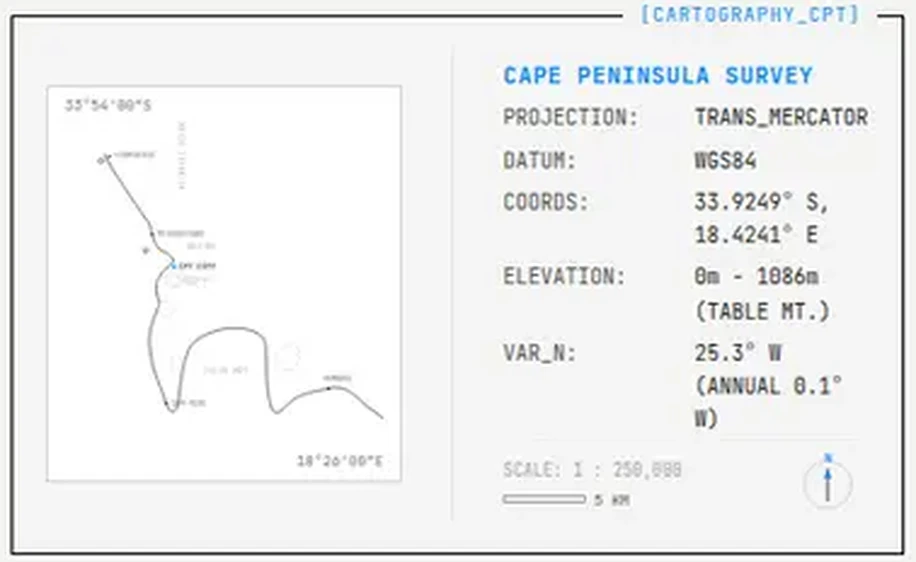
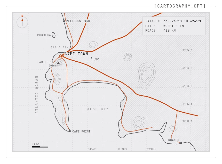
The July map was a sketch: a few hand-drawn curves standing in for the peninsula, a spec table beside it, and colours hard-coded for light and dark mode. The new survey plate is built from real map data and spans the full width of its module.
| July | September |
|---|---|
 |  |
A Projection You Can Measure With
The coastline is Natural Earth 1:10m land data, projected equirectangular about 34°S (x = Δlon · cos 34° · 380, y = −Δlat · 380). The peninsula has its real shape, and the 10 km scale bar in the corner is honest. Contours trace the Table Mountain chain, the Hottentots Holland, Kogelberg, Helderberg and Tygerberg under a 0.1° graticule, and labels mark Table Mountain (1086m), Robben Island, Melkbosstrand, Cape Point, UWC and Hermanus.
Roads Grown by Scroll
Ten main routes leave the city: the N1, N2, N7, M3, M6, R27, M4, R310, R44 and R43, with waypoints hand-placed along their real alignments. The network doesn’t play on a clock. Scroll position drives it: the roads grow out of the CBD as the module crosses the viewport, and pull back in when you scroll up. Growth is measured in network distance, so every road front moves at the same speed, and a branch only starts once its parent reaches the junction. The M4 and R310 wait for the M3, the R44 waits for the R310, and the R43 waits for the N2.
/** Grow the network to fraction `p` of its full reach, 0 → 1. */
function paint(p: number) {
	const reach = Math.max(0, Math.min(1, p)) * net_length;
	let drawn = 0;
	spans.forEach(({ start, length }, i) => {
		const d = Math.max(0, Math.min(length, reach - start));
		road_els[i].style.strokeDashoffset = String(1 - d / length);
		drawn += d;
	});
	net_km = Math.round(drawn * KM_PER_UNIT);
}
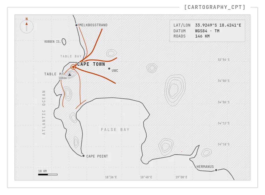
The ROADS readout counts the kilometres on the plate. At the top of the page only the network nearest the city is drawn, 146 KM of it; scrolled into place, the whole network is out and it reads 420 KM. When the page loads, the same growth plays out over 900ms, so the map is already on the table by the time the device finishes starting up.
Parallax on Hover
Hovering the plate lifts the drawing into a shallow stack of depth layers: the graticule at the back, then land and terrain, then water labels and landmarks, with the roads nearest. Each layer zooms about the map’s centre by its own depth and slides away from the cursor by the same depth, so the survey reads as a stack rather than a print. The compass, the readouts and the scale bar sit on the glass above it and never move. It’s mouse-only and turned off under reduced motion, because it’s decoration, not information.
| Top of the page | Scrolled into place and hovered |
|---|---|
 | 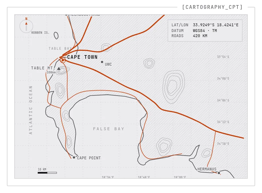 |
Like everything else on the site, the map is drawn entirely in faceplate tokens, so the roads take on each plate’s accent colour.
Everything Else
A Motion System and a Power-On Sequence
All animation now goes through one module, $lib/motion, built on anime.js v4. Its rules: LEDs and state changes step instead of easing, panels move on one shared curve, and nothing bounces or overshoots. The single exception is the PO-100’s knobs, which spring into their detents “because the object is a spring”. Scroll-driven effects have no duration at all; they are mapped straight to scroll position.
The first visit in a session plays a power-on sequence. Modules seat in a fixed order (status bar, heading and bio, map, PO-100, F-keys, footer), the heading decodes itself out of random characters locking left to right, and displays flicker on in hard steps instead of fading. Nothing is hidden for visitors without JavaScript or with reduced motion, and a four-second failsafe unhides the page if the app bundle never arrives.
The PO-100: 3D and Back Again
On 20 September the PO-100 briefly became a real object: a three.js model built from primitives, with flat toon shading, colours read from the faceplate tokens, and a USB-C cable that slid into the port while charging. It sat on top of the 2D module, which stayed the real interface underneath, and loaded as a separate 131 KB (gzipped) chunk, fetched only after a WebGL2 check and never on mobile or with reduced motion. Two days later it was gone, along with the pinned hero that used to walk the PO-100 through its display modes as you scrolled. The 2D PO-100 is the whole device again. It now powers up on the plain photo instead of the LCD filter, and its knobs are real sliders you can drag or turn from the keyboard.
A Photo Viewer
Every image in a post now opens in a PHOTO_VIEWER: a dark device screen with the image in a screwed-down bezel and a caption bar that reports the file name and its real pixel dimensions. It strikes up like a CRT instead of fading in, steps through the post’s images with the arrow keys or a swipe, preloads the neighbouring shots, and traps focus while it’s open. Try it on any screenshot in this post.
Keyboard Control
F1 to F4 jump to the blog, projects, resume and gear pages, ? opens a KEY_MAP overlay listing the shortcuts, and J/K move focus up and down the rows of the post and project lists.
An Honest Battery
The battery readout in the status bar used to start at 100%. It now shows --% until the Battery API reports a real number, because, as the code puts it, “a device that shows 100% when it has 42% is lying”. Clicking it still sets off the charging marquee from the last post.
Housekeeping
- Every page now has proper meta tags, a canonical URL and a 1200×630 share image, and the site has an RSS feed, a sitemap and a robots.txt.
- Keyboard users get a visible focus ring, and the battery readout is a real button.
- Broken links land on a proper
SIGNAL_LOSTerror page instead of SvelteKit’s bare default. - Post URLs are lowercase-kebab now, and the old addresses redirect permanently, because “a link that has been published once is a promise”.
- GSAP was imported on the home route but never used. Dropping the import took the home chunk from 124 KB to 45 KB, and the same pass deleted six unused components and four unused dependencies.
- The AI disclaimer at the top of this post is its own component now. Amber means “warning” on this site, and that box is the only place it appears.
- Four project write-ups are live under Projects: this portfolio, my MSc thesis prototype (Relativistic Quantum Tokens), the previous version of this site, and InceptionAR.
The Engine Room: The Models Behind It
Like July’s redesign, this round was built with AI models. Most of it was orchestrated with oh-my-pi, which drove the models below, and some of the design decisions came from Kimi K3. In order of how much they were used:
- DeepSeek Flash V4.1, the most-used model of this round
- DeepSeek Flash V4.0
- Kimi K3, which also made some of the design decisions
- Gemini Flash 3.8
- Opus 5.0
- Opus 5.5
- Gemini Flash 3.7
The commit history shows how the work went. Ideas were tried and thrown out quickly: three palettes in fifteen minutes, and a 3D PO-100 in two days. Many commits also carry their own measurements. The focus-pull commits timed real navigations to confirm that the page swaps on a frame where the veil is at full cover, so the swap itself never reaches the screen.
The device is still the same 700-pixel chassis it was in July. It just has more faceplates now, a softer way of changing pages, and a map worth scrolling for.
Update, 25 September: The Gear Bench
This post went up on 22 September, and the device kept moving. Seven more commits landed between 23 and 25 September, touching 19 files with 2,113 lines added and 317 removed. Unlike everything above, which was a mix of seven models, every one of those commits was written by Opus 5.5 alone, driven through oh-my-pi.
| Date | What landed |
|---|---|
| 23 Sep | A brand mark in the status bar, a full-width charge banner and a real USB-C plug on the PO-100; machined knob caps shared by the PO-100 and TE-S10 |
| 25 Sep | Line drawings and folded spec sheets on the gear page; the AGENT_WORKFLOW module; a Pi 5 that fits its accessories; touch parity; the Nothing Phone (2)‘s charging Glyph |
The Status Bar Gets a Name
The DEV-PORTFOLIO label and its LED are gone. The left of the bar now carries an IT monogram, inked in the current plate’s colours, beside ISA TIPPENS. The MODE dial moves to the centre, the KEYS button hides on touch-width screens where there is no keyboard to map, and the battery gauge gains a terminal nub and a charging bolt with current running through the cell.
The charging marquee is now a banner: an opaque strip wipes across the whole bar, the ticker enters from the right edge and leaves off the left, and then the strip wipes away again.
A Real USB-C Plug
The PO-100 has a USB-C receptacle cut into its bottom edge, under the PWR label, and it is a real button: click the port to plug the charger in, and click the connector to pull it back out. The plug is drawn as the real thing, with a metal shell, an overmould, a ribbed strain relief and a shaded cable fading off the edge of the case. It travels straight up into the port along its own axis, sparks as it seats, and the screen surges for a beat, the way a backlight jumps when the supply switches over. The glass also catches a soft glare under the mouse pointer (“a finger is not a lamp”), and the REC lamp now blinks.
Unplugged and plugged back in, at half speed:
Machined Knobs
The knobs on the PO-100 and the TE-S10 now share one KnobCap component: a coloured cap in a knurled, polished-metal skirt. The knurl, the lathe rings and the pointer turn with the knob, while the specular highlight stays where the light is. Cap colours are faceplate tokens (--hw-knob-1 to --hw-knob-4), so the PS1 and PS2 plates now run all four controller symbols: cross, triangle, square and circle. The PO-100 itself was brought up to the TE-S10’s standard, with a rounded moulding, a rounded screen bezel, an inset knob module with a printed scale, and domed keys shared with the TE-S10, along with its screws.
Drawings on the Gear Page
Every hardware module on the gear page now carries a line drawing, set into a sunk well on the drafting dots, with its spec sheet folded behind a [+] SPECS disclosure that opens with the CRT strike-up flicker. The drawings are inked only in plate tokens, so every faceplate repaints them.
- Raspberry Pi 5 and Pi 4: top-view schematics lifted from the official mechanical drawings, with component labels and the 85 × 56 mm dimensions.
- Nothing Phone (2): the back traced to scale, with all eleven Glyphs.
- Laptop and tablet: a generic 16” laptop with an editor on screen, and an 11” tablet with a notes page and a stylus.
The Pi 5 drawing is also a toggle. Tap or click it and it fits the board’s accessories in assembly order: the official Active Cooler, then the M.2 HAT+ on its standoffs, then a 256GB Raspberry Pi SSD (M.2 2230) in the socket. They come off again in reverse. The outlines come from the product briefs’ mechanical drawings, registered on the board’s mounting holes, and the cooler under the HAT shows through as dashed hidden lines.
Fitting and stripping, at half speed:
The phone drawing plays a Glyph notification the same way: every Glyph double-flashes in steps, cascading from the camera ring down to the exclamation mark. And when a charger is plugged in, the exclamation mark becomes the charging meter the real phone shows: the dot lights, the bar climbs from its foot to the battery’s level, holds for 2.5 seconds and drains again, pausing the notification while it runs.
| Notification (real time) | Charging meter (half speed) |
|---|---|
Both drawings are real toggle buttons: a tap, a click or Enter/Space holds the effect on, and a mouse also previews it on hover. A finger never previews, so a second tap always switches it off. With reduced motion, the Glyphs hold lit instead of flashing, the parts go on without the stagger, and the charging meter rests at the battery’s level.
The Agent Workflow Module
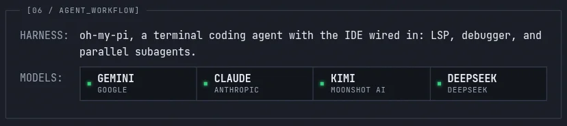
The old Gemini pair-programming row on the gear page is replaced by 06 / AGENT_WORKFLOW: oh-my-pi as the harness, with the model families it drives racked as live slots beside their labs. The rest of the dev environment became label/value spec sheets built from a single list, with the operating systems split per lab node (PiOS on A, NixOS on B), so no raw HTML strings are left on the page.
Touch Parity
Some of the device only answered to a mouse. Now it answers to touch too:
- Socials deck: the first tap on a channel tunes to it, giving the same TRANSMIT TO readout, REC lamp and knob presets a hover gives a mouse, and the second tap follows the link. A tap off the deck or Escape parks it.
- Knobs: two quick taps reset a knob to its preset, the touch version of a double-click.
- Survey map: the Cape Town cartography is no longer hidden on narrow screens.
Smaller Fixes
- Post rows put the date and ID on one line, so titles get the full width, and undated drafts read
UNDATEDand sort last. - The GAMING_LOG tag is no longer clipped by its own scroller.